Forky Porky’s is a catering company based in Rainham, Kent, UK. Their specialties include hogroasts and spitroasts, serving a a range of domestic and commercial events with a focus on affordable, traditionally cooked fare with a modern edge.
Forky’s owner had experience running a successful hogroast outlet years beforehand; stopping to travel the world and engage with other business ideas. The gentleman had kept the hogroast equipment for all of that time with the main trailer and roasting ovens laying dormant, ready to be dusted off and revived once more.
From our initial talks regarding a logo, I had become intrigued in the vision for the brand and its development into a fully fledged business. I was shown past material and menus and it was clear that the catering market had moved on considerably since the initial venture had been shut down, what had worked before would not work again the second time around.
The challenge ahead of Forkys was the following - how was it going to stand out on the market against a backdrop of fast food chains, local restaurants offering burgers, pulled pork and roasts, gastropubs and delivery-based dark kitchens? We sat down with our napkins and began brainstorming.
No brief existed for Forkys at its inception and as a designer this is the equivalent of staring at a blinking cursor on a screen - you can take immense joy in having total freedom but the flipside is that designing with no brief can become an entirely overwhelming prospect. We took care with our initial market research as the data could better inform a direction. We noticed the following patterns from other hogroast companies across the UK:
-
Frequently male-owned, male target audience.
-
Old-world style that felt more spit and sawdust pub than pop-up pork.
-
Traditional Butcher Shop / English Racing Green colouring.
-
Drab menus that failed to get the tastebuds engaged or capture the eye.
-
Little accommodation for allergens and dietary requirements, businesses were missing the opportunity to include a wider catchment of diners.
With the previous analysis in mind, we worked together to format an identity that stood as an antithesis to the ‘boring’ brands which had taken the market share. *We took the decision to push against the established look of other brands because Forky Porky’s was its own, fresh entity to the market and therefore had the opportunity to manifest curiosity and stand alone. My client was ready for a change in career and the operational decision to ‘go bold’ had low potential risks. *It’s worth noting here that in larger businesses, such decisions can carry heavy penalties if a costly brand relaunch fails and so decisions are better informed by further market analysis before proceeding with riskier strategies.
Following the decision to ‘go bold’, we cherry-picked the traditional elements we liked and established the design language we would implement, namely; roundels and stamps that held a vintage feel to pay homage to the traditional side; informal hand-drawn iconography and illustration; bright colours that stood out and were food-adjacent in hue (no unnatural non-food colours); and finally, analogue textures such as paint and pencil for a homespun, handcrafted aesthetic.
Typography and colours were addressed first, a rough and friendly condensed typeface allowed for easier display on future promotional assets and the body font contains certain irregularities which contribute to the informal nature whilst simultaneously staying legible and modern to suggest hygiene and competence. A shocking, fluorescent pink was chosen for the brand’s primary colour with ‘mustard’ yellow and ‘pepper grey’ as secondaries. The choice of pink was entirely necessary for Forky’s appeal to differentiate it from the crowd of greens and blues. The pink also served to benefit from a closer affinity with a female demographic as wedding catering bookings were a focus for my client and this colour pertained to pigs, pork products and playful brands.
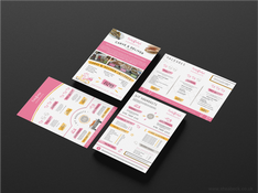
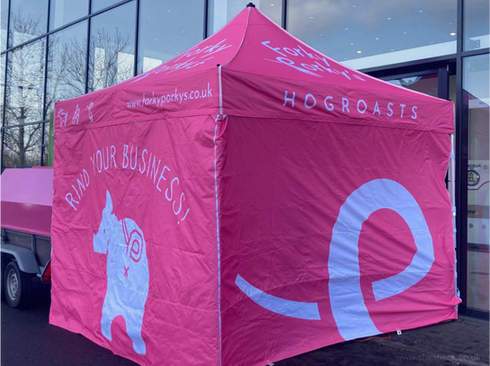
We applied the use of a signature ‘fork’ element as a cornerstone of the iconography symbolising food, mealtimes and catering at large. Together, we created menus and promotional media before tackling the larger, physical touchpoints which would enable the company to be marketed at long distances - a bright event gazebo with multiple panels and the trailer used to transport the ovens and equipment to and from sites.
It was from experimenting with panel designs that an unexpected side of the brand revealed itself to us, we could make the brand more daring and expand its use of playful elements to endear people towards the assets and the pig characters inside its iconography. This altered our perception and assisted us in writing copy and forming a flavour for the brand which was lacking in that of its competitors.
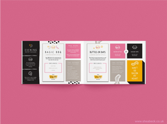
From the attached material you can witness the development of materials for Forkys and how the media shares the same cohesion across the many platforms that the identity engages with. The direct statements and pun-inspired copy spark curiosity and amusement, further establishing an effect that is approachable and trustworthy. The use of block backgrounds, outlined boxes and a recurrent colour theme allow menus and package deals to be stay navigable for comparing menu items and packages. Texture (such as grill marks, spilled condiments or handwriting) is used to pull the media into a catering setting and enhance the connection of the customer with sentiment towards favourite food, recipes and family meals.
Upon finalising the project, Forky’s owner reported success in new bookings and on receiving tonnes of positive feedback regarding the punchiness and effect of the new identity. He mentioned that, in comparison to his past brand and its contemporaries, Forkys had a truly distinctive proposition and he couldn’t be happier with the way it grabbed attention at events and out on the road. Our attention to detail early on in the process and an unwillingness to compromise on smart finishes / investment into printing had paid off in full.
If you have a business or individual brand that requires starting up from scratch or renewal then you may benefit from a similar approach to Forky Porky’s Hogroasts. With years of experience in identity, I work with you to ascertain the one-of-a-kind value that your business can offer the market and use these qualities to create an identity that you can be proud to represent, with the agility to scale as you grow from napkins to tablecloths .


